
Appearance
Forecasting Model: Analytics
Quick Answer
The Forecasting Model workspace tab is the Predictive Power Center for a project's accepted Zeustimate model. It has two sub-tabs: Settings (tune the model's configuration and rebuild parameters — see Forecasting Model: Settings) and Analytics (live dashboard with model accuracy sections, AI summaries, and a project mini-chat). The Analytics sub-tab is an Enterprise feature — Emerging accounts see a preview illustration rather than live data.
Getting There
- Open the left sidebar.
- Under the Locate product group, click Forecasting Model.
- The tab opens in the workspace panel beside the map.
You can also open it from the workspace Tabs Menu: click the ≡ icon at the right end of the tab strip, browse to the Project category, and click Forecasting Model.
Sub-tabs
The header toggle switches between two views:
| Sub-tab | What it is |
|---|---|
| Settings | Model configuration and rebuild controls — trade areas, variables, outlier accuracy, and more. See Forecasting Model: Settings. |
| Analytics | Live analytics dashboard for the project's accepted Zeustimate model. |
Analytics Dashboard
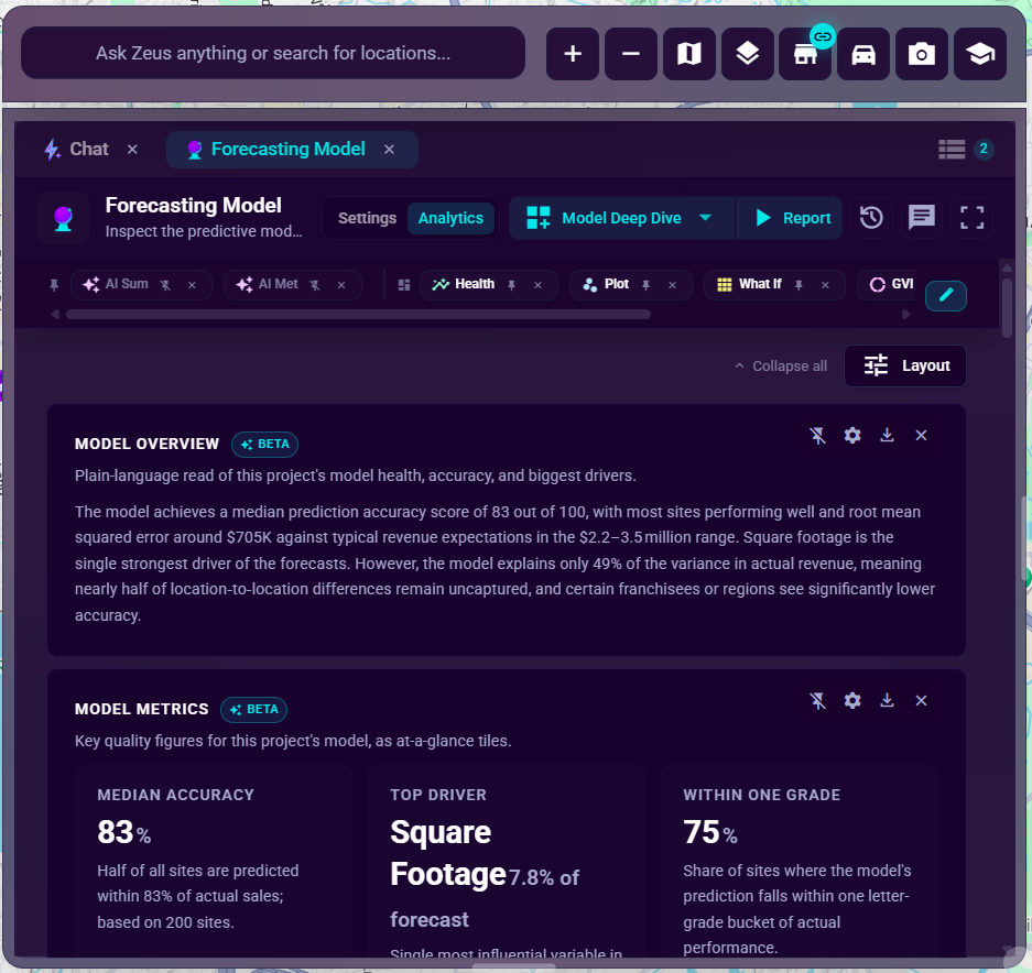
When your account is entitled (Enterprise tier), the Analytics sub-tab loads a project-scoped dashboard. It mirrors the Location Analytics and Shape Analytics dashboards in structure: sections are arranged in a grid, and you can reorder, add, remove, pin, and configure each section.
Accessing the Dashboard
- Click Analytics in the header toggle.
- The dashboard loads the project's accepted Zeustimate model statistics automatically.
- If the project has no accepted model, sections display an empty state rather than charts.
Fullscreen
Click the expand icon in the tab header to go fullscreen. The tab overlays the map and chat area. Press the icon again (or Escape) to exit.
Sections
The following sections are available on the Analytics dashboard. Each section is collapsible and has its own gear icon for Display Options.
AI Summary (pinned)
An AI-written narrative overview of the model, drawn from a saved prompt in your Prompt Library. The response is cached project-wide so all team members see the same output until it is refreshed. Use the gear menu inside the section to change the prompt or force a refresh. See AI Summary and Metrics Sections.
AI Metrics (pinned)
Structured metric tiles generated from a saved prompt, summarizing key accuracy statistics in a scannable format. Same caching and prompt-library behavior as AI Summary. See AI Summary and Metrics Sections.
Model Health
A radar chart with supporting metric tiles showing overall model fitness across several accuracy dimensions. Use the gear (Display Options) to configure which dimensions appear on the radar and the order of tiles.
Actual vs Zeustimate
A scatter chart plotting each site's actual revenue against its Zeustimate forecast. Points are color-coded by accuracy. The section also surfaces quadrant-based recommendations (for example, sites that are consistently under- or over-forecast). Outlier sites are listed below the chart. Adjust Display Options to change the view and axis scale.
Binning / What-If
A portfolio-level view of how sites distribute across forecast bands (bins). The What-If controls let you adjust bin thresholds interactively to see how the portfolio would shift under different accuracy assumptions — adjustments are exploratory only and do not alter the saved Revenue Grades or project settings.
Global Variable Importance
A project-wide sunburst chart showing which model variables (demographic, trade-area, and custom attribute factors) drive the Zeustimate predictions for this portfolio. Drill into a segment to see sub-factors. Use Display Options to sort by impact or alphabetically.
Predictive Power Map
A choropleth map coloring U.S. Census regions by the model's average accuracy in that region. Darker color means stronger predictive power; lighter areas indicate regions where the model generalizes less well. Use Display Options to adjust the geographic aggregation level and color scale.
Based on the training snapshot. This map reflects the set of sites that were in the accepted model's training snapshot at the time it was built, not the project's live sites. It therefore includes sites that were part of training even if they were later edited or removed, and it does not shift as you change the live site list. This keeps the accuracy picture stable and matches how the model was actually built.
Attribute x Region Heatmap
A matrix cross-tabulating model accuracy by site attribute (rows) and U.S. Census region (columns). Use this to identify attribute segments or geographies where the model is consistently strong or weak. Display Options let you choose the attribute dimension and region grouping.
Based on the training snapshot. Like the Predictive Power Map, this matrix groups sites by the attribute and region values recorded in the accepted model's build-time training snapshot rather than their current live values. Counts can include sites that were in the training set even if they were later removed, so the breakdown stays consistent with the model as built.
Reordering and Customizing Sections
The Analytics dashboard supports the same layout controls as Location Analytics:
- Drag a section's grip handle to reorder it in the grid.
- Add / remove sections using the pill bar above the grid or the
+button at the bottom of the list. - Pin a section (AI Summary, AI Metrics) to keep it anchored above the main grid.
- Unpin to move it into the scrollable body.
- Changes stage as a draft. A floating Save bar appears at the bottom — click Save to persist the layout or Discard to revert. Saving for the first time on a system (Starter) template prompts you to name your custom view.
AI Chat for the Model
A chat toggle button in the Forecasting Model tab header opens an inline mini-chat panel scoped to the current project. Use it to ask questions about the model without leaving the dashboard. The chat has access to all six model analytics tools and can surface results as interactive cards inline:
getModelHealthgetActualVsForecastgetBinningAnalysisgetGlobalVariableImportancegetPredictivePowerMapgetAttributeRegionAccuracy
Reports and History
- Report button: Run a project-scoped report from the Analytics dashboard. Only available on the Analytics sub-tab.
- History button (clock icon): View past reports generated for this project's model. Opens an inline history sheet without leaving the tab.
- Download (gear on each section): Export an individual section as a JPEG image.
Entitlement
The entire Forecasting Model tab — both the Analytics and Settings sub-tabs — is available on the Enterprise subscription tier. Accounts on lower tiers can still open the tab but see a preview illustration with an upgrade prompt instead of live data on either sub-tab. No model data is fetched for non-entitled accounts. Contact your SiteZeus account team to discuss upgrading.
Settings is not a "coming soon" surface — every card except Model Type & Parameters (not currently visible anywhere) is fully functional today. See Forecasting Model: Settings.