
Appearance
Understanding the Zeus.ai Screen Layout
Quick Answer
Zeus.ai has a map-centered layout with AI chat access, map controls, and an optional secondary workspace area for detailed analytics, site lists, and map settings. Navigator mode (chat in the top toolbar, docked workspace panels) is the default; Modern mode (floating chat bar bottom-left, floating panels) is available as an alternative.
Desktop Layout Overview
When you open Zeus.ai on a desktop computer, you'll see:
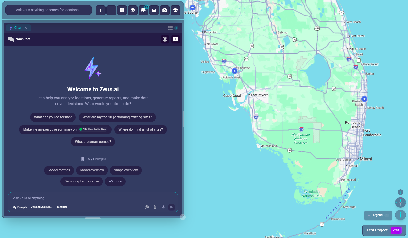
┌─────────────────────────────────────────────────────────────┐
│                                                             │
│                                                             │
│                    MAP AREA                                 │
│                    (center of screen)                       │
│                    - Shows location markers                 │
│                    - Interactive zoom/pan                   │
│                                          [Project Name] ◄───┼─── Bottom-right corner
│                                                             │
├─────────────────────┬───────────────────────────────────────┤
│                     │                                       │
│  CHAT BAR           │      WORKSPACE PANELS                 │
│  (bottom-left)      │      (layout dependent, optional)     │
│  - AI chat input    │      - Analytics tab                  │
│  - Map controls     │      - Sites list tab                 │
│  - Help/Profile     │      - Zeus.ai Chat tab               │
│                     │                                       │
└─────────────────────┴───────────────────────────────────────┘
Main Screen Regions
1. The Map Area (Center)
What you see: An interactive map covering most of the screen Purpose: Shows all your location markers (pins) Key features:
- Location markers with different colors by type
- Clusters (circles with numbers) when zoomed out
- Click markers to view details
2. The Chat Bar (Bottom-Left)
What you see: A dark, rounded panel with a text input field Location: Fixed at the bottom-left of the screen Purpose: Your main control center for AI interaction and map controls
Contains (left to right):
- Back button (
arrow_backicon ←) - Returns to projects list - Chat input field - Type your questions here (click to expand for more options)
- Zoom buttons (
add+ andremove−) - Control map zoom level - Layers button (
layersicon 📚) - Opens the Layers tab: clustering, filters, and data-layer toggles (Desktop only) - Base Map button (
mapicon 🗺️) - Opens the Base Map tab: map theme, labels, and base cartography (Desktop only) - Sites button (
storeicon 🏪) - Opens filter/sites panel - Help button (
schoolicon 🎓) - Opens help documentation in a new tab (Desktop only) - Profile button (your initials) - Account settings and logout
When chat input is expanded, additional options appear:
- My Prompts - Quick access to saved prompts (document icon)
- Model selector - Choose AI model (O3 is default; Claude, Gemini, GPT models also available)
- Voice input - Speak your question (microphone icon)
- File attachment - Attach files for context (attachment icon)
3. The Secondary Panel (Right Side)
What you see: A workspace panel area that may be floating, docked, or collapsed Location: Often beside the map on desktop; layout varies by mode Purpose: Detailed views, filters, and analytics
Contains tabs for:
- Sites - Filter and search locations by attributes, revenue, type; "Filtering Map" toggle
- Location Analytics - Detailed insights for selected locations (Zeustimate, Demographics, Variable Importance, Smart Comps)
- Zeus.ai Chat - Expanded chat conversation view with full history
- Layers - Clustering, site filters, and data-layer toggles
- Base Map - Map theme, labels, base cartography, and POIs
Panel interactions:
- Drag the left edge to resize width
- Use the collapse / close controls to collapse or hide panels
- Drag the header to undock and float the panel
- Click the pin icon to dock back to the edge
4. Project Name Badge (Bottom-Right)
What you see: A small dark badge with your project name Location: Bottom-right corner of the map Purpose: Shows which project you're viewing Bonus: May show a colored "Power Score" percentage
Mobile Layout Overview
On phones and tablets, the layout adapts to fit smaller screens:
┌─────────────────────────┐
│ [←]   Project Name   [👤]│  ◄── Top bar (separate from chat bar)
├─────────────────────────┤
│                         │
│                         │
│       MAP AREA          │
│       (full screen)     │
│                         │
│                         │
├─────────────────────────┤
│  [Chat Input]    [🗺️]   │  ◄── Chat bar (bottom)
└─────────────────────────┘
Key differences on mobile:
- Back button (
arrow_back←) - Fixed at top-left corner of screen - Project name - Centered at top with optional Power Score badge
- Profile button (👤) - Fixed at top-right corner of screen
- Chat bar - Compact toolbar at the bottom with simplified controls
- Map controls - Accessed via mapping options button (🗺️) which opens a popup menu
- Workspace panels - Open as an expanded bottom-sheet style container
- Compass - Appears with mobile map controls when 3D-capable map controls are active
Workspace Layout Modes
Zeus.ai offers two layout modes that change how workspace panels interact with the screen. Since the workspace refresh, Navigator is the default mode for new projects and on first login.
How to Switch Layout Modes
- Open the profile menu (your initials in the chat bar on desktop, or the bottom-right of the sidebar / top-right on mobile)
- Under Layout, choose between:
- Modern (floating chat bar + floating panels)
- Navigator (top-toolbar chat + docked panels) — default
- Your preference is saved automatically and persists per device
Modern Mode (Floating Layout)
Modern Mode features a floating chat bar at the bottom-left of the screen with workspace panels that overlay the map.
┌─────────────────────────────────────────────────────────────┐
│                                                             │
│                    MAP AREA                                 │
│                                          ┌─────────────────┐│
│                                          │ Workspace Panel ││
│                                          │ (stays above    ││
│                                          │  chat bar)      ││
│                                          └─────────────────┘│
├─────────────────────┬───────────────────────────────────────┤
│  CHAT BAR           │                                       │
│  (floating)         │                                       │
└─────────────────────┴───────────────────────────────────────┘
Key characteristics:
- Chat bar floats at the bottom-left
- Workspace panels float over the map
- Panels stay above the chat bar (~120px from bottom)
- Clean, modern aesthetic with optimized positioning
Best for: Users who prefer a contemporary interface with floating panels and maximum map visibility.
Navigator Mode (Multi-panel Layout, Default)
Navigator Mode features a chat bar integrated into the top toolbar with workspace panels that dock to screen edges. It is the default mode for new projects.
┌─────────────────────────────────────────────────────────────┐
│ [Menu] [Back]  [Chat Input...]  [+][-] [🗺️][🏪][🎓] [Profile]│  ◄── Top toolbar with chat
├─────────────────────────────────────────────────────────────┤
│                                                             │
│                    MAP AREA                                 │
│                    (full height available)                  │
│                                                             │
│                                          ┌─────────────────┐│
│                                          │ Workspace Panel ││
│                                          │ (can reach      ││
│                                          │  bottom edge)   ││
│                                          └─────────────────┘│
└─────────────────────────────────────────────────────────────┘
Key characteristics:
- Chat bar is at the top, spanning full width
- Workspace panels dock to either screen edge — side-agnostic docking lets you drag a panel's header to the left or right edge and the dock snaps accordingly
- Primary panel opens at 400px wide by default and can be resized down to 300px or out toward half the viewport
- Panels can reach within 20px of the bottom of the viewport
- More vertical map space available
- Option for an independent Secondary Workspace panel on the opposite edge
Best for: Users who prefer a traditional navigation-style interface with docked panels.
Secondary Workspace (Navigator Mode Only)
Navigator Mode supports a second, independent workspace panel:
- Open the profile menu
- Confirm Layout is set to Navigator
- Toggle Secondary Workspace on
The secondary workspace docks to the opposite edge of the primary, defaults to 450px wide, and holds its own tab stack — useful for keeping Location Analytics open on one side while the Sites list or Site Sonar runs on the other.
Each workspace panel (primary and secondary) supports a multi-cell grid — drag a tab to split a cell or drag it to the panel edge to add a full-span row or column. See Arranging Tabs Across Multiple Cells for details.
Layout Mode Comparison
| Feature | Modern (Floating) | Navigator (Multi-panel Layout) — default |
|---|---|---|
| Chat bar location | Bottom-left floating | Top toolbar |
| Panel style | Floating over map | Docked to either edge (side-agnostic) |
| Panel bottom limit | Above chat bar (~120px) | 20px from bottom |
| Primary panel default | 400px wide | 400px wide |
| Panel minimum widths | 300px | 300px |
| Secondary workspace | Not available | Available (450px default) |
| Panels respect each other | Yes - cannot overlap | Yes - cannot overlap |
Finding Key Elements
| What you need | Where to look | Icon |
|---|---|---|
| Type a question | Chat input in the chat bar (bottom-left) | Text field |
| Zoom the map | + and − buttons in chat bar, or scroll wheel | add / remove |
| Go back to projects | Next to menu button (desktop), or top-left (mobile) | arrow_back (←) |
| Filter locations | Sites button in chat bar | store (🏪) |
| Change map theme | Base Map button in chat bar (desktop) or mapping menu (mobile) | map (🗺️) |
| Toggle map data layers | Layers button in chat bar (desktop) or mapping menu (mobile) | layers (📚) |
| Get help | Help button in chat bar (desktop only) | school (🎓) |
| See your profile | Right side of chat bar (desktop), or top-right (mobile) | Your initials |
| View location details | Click a marker on the map | Marker pin |
| See all locations | Open Sites panel | store |
| Select AI model | Click chat input to expand, then use model selector | Dropdown |
| Use saved prompts | Click chat input to expand, then click My Prompts | description |
Visual Appearance
The Chat Bar Appearance
- Background: Dark, semi-transparent (glass effect)
- Border: Subtle white/gray border
- Shape: Rounded corners
- Buttons: Square with rounded edges, subtle hover glow
Buttons & Icons
- Standard buttons: Dark background, white icons
- Hover effect: Slight scale-up, glow effect
- Active/selected: Electric blue glow
Tips
- Hover over any button to see a tooltip explaining what it does
- The chat bar can expand - click the input field to see more options
- The secondary panel can be resized - drag its left edge
- You can undock the secondary panel - drag its header to float it