Appearance
Icon Guide - What Do the Buttons Mean?
Quick Answer
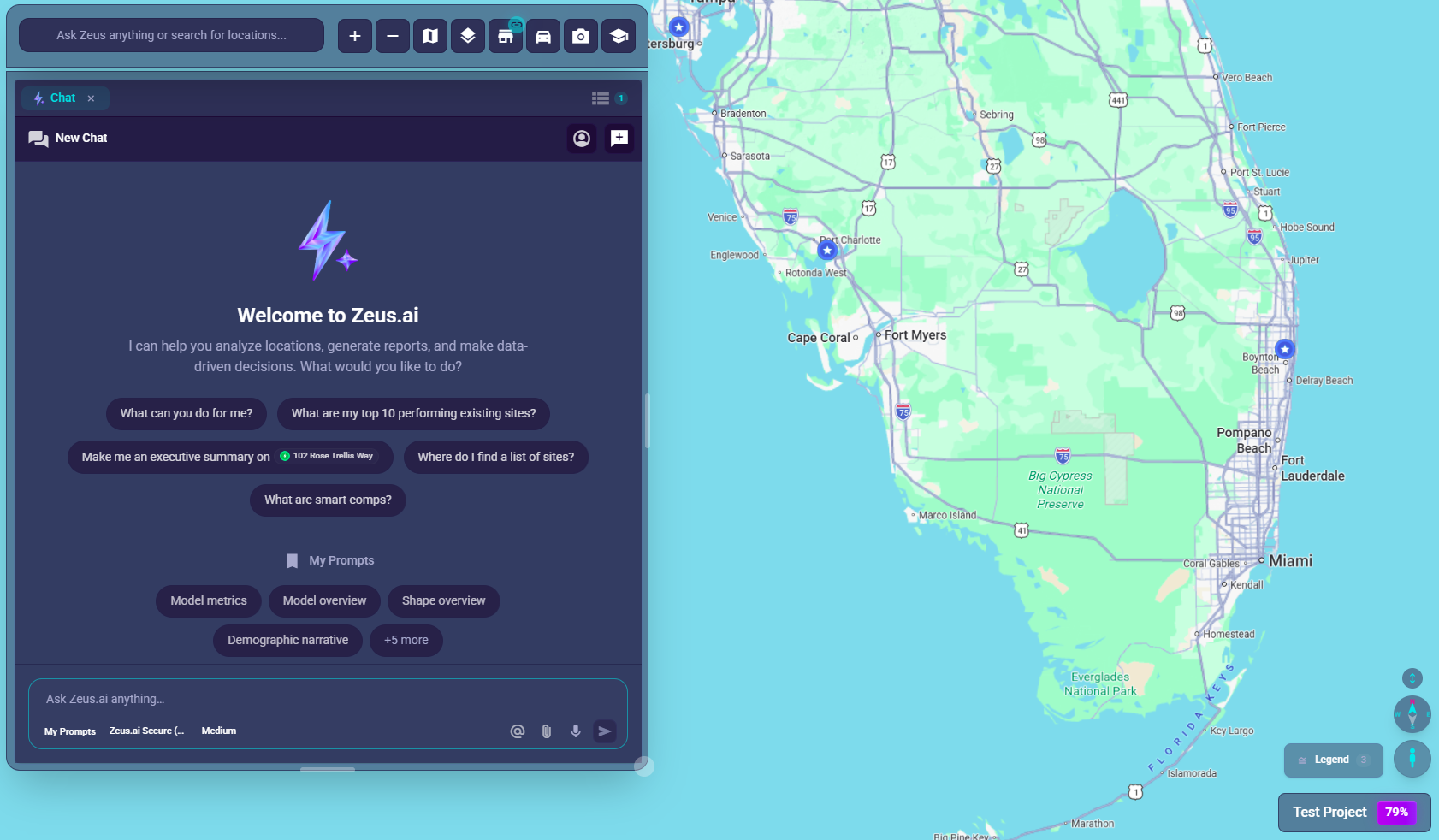
Zeus.ai uses Material Icons throughout the interface. This guide explains what each icon means and where to find it.
Chat Bar Icons (Bottom-Left)
These icons appear in the main chat bar at the bottom-left of your screen:
Navigation Icons
| Icon | Material Icon | What It Does | Where to Find It |
|---|---|---|---|
| ← | arrow_back | Returns to the projects list | Next to menu (desktop) or top-left (mobile) |
| 🎓 | school | Opens the help site | Desktop chat bar |
| 👤 | Your initials | Opens account settings | Far right of chat bar (desktop) or top-right (mobile) |
Map Control Icons
| Icon | Material Icon | What It Does | Where to Find It |
|---|---|---|---|
| + | add | Zooms the map closer | Right side of chat bar |
| − | remove | Zooms the map out | Right side of chat bar |
| 🗺️ | map | Opens map visual options (themes, layers) | Right side of chat bar (desktop); in mobile controls menu |
| 🏪 | store | Opens the site filter panel | Right side of chat bar |
Chat Input Icons (Expanded Composer)
| Icon | Material Icon | What It Does | Where to Find It |
|---|---|---|---|
| @ | alternate_email | Add a specific location to your message | Mention button in composer |
| 📎 | attach_file | Upload images or documents | Attachment button in composer |
| 🎤 | mic | Speak your question instead of typing | Voice input button |
| ➤ | send | Send your message | Action button (when input has content) |
| ⏹ | stop | Stop the AI while it's responding | Action button (when AI is active) |
Chat Composer Options
| Icon/Element | Material Icon | What It Does |
|---|---|---|
| 📄 | description | Access "My Prompts" - saved favorites for quick insert |
| Model dropdown | Dropdown menu | Choose AI model (O3 default; Claude, Gemini, GPT also available) |
| Context meter | Progress bar | Shows how much context is being used |
Secondary Panel Icons
These icons appear in the panel on the right side of the screen:
Tab Icons
| Icon | Material Icon | Tab Name | What It Shows |
|---|---|---|---|
| 💬 | chat | Zeus.ai Chat | Expanded chat conversation |
| 🏪 | store | Sites | List of all locations with filters |
| 📊 | analytics | Location Analytics | Detailed insights for a selected location |
| 📚 | layers | Layers | Clustering, filters, data-layer toggles |
| 🗺️ | map | Base Map | Map theme, labels, base cartography |
Common Action Icons
| Icon | Material Icon | Action | What It Does |
|---|---|---|---|
| ✕ | close | Close | Closes a panel or dialog |
| + | add | Add | Adds a new item or tab |
| 🔍 | search | Search | Search within a list |
| ⋮ | more_vert | More Options | Opens additional menu options |
| 📌 | push_pin | Pin/Dock | Docks floating panel to edge |
| ▼ | expand_more | Expand/Collapse | Toggle panel collapse state |
Map Marker Icons
These icons appear on location markers on the map:
| Marker Color/Style | Meaning |
|---|---|
| Blue pin | Existing Mature site |
| Purple pin | Existing New site |
| Cyan pin | Non-Traditional site |
| Gray-blue pin | Closed site |
| Green pin | Proposed site in Consideration |
| Orange pin | Letter of Intent (LOI) |
| Pink/Magenta pin | In Development |
| Lime green pin | Trade Area Seed |
| Pink/Red pin | Search result |
| Numbered circle | Cluster - multiple locations grouped together |
| Pulsing/glowing pin | Currently selected location |
For full marker details, see Markers and Icons.
Status Indicators
Connection Badge (on Sites button)
| Badge Color | Meaning |
|---|---|
| Green dot | Connected and synced |
| Yellow dot | Syncing or partial connection |
| Red dot | Connection issue |
| No badge | No active filters |
Loading States
| Icon/Animation | Meaning |
|---|---|
| Spinning circle | Loading data |
| Pulsing border | AI is thinking/processing |
Understanding Icon States
Button States
- Normal: Subtle white icon on dark background
- Hover: Icon brightens, button slightly enlarges
- Active/Selected: Electric blue glow around button
- Disabled: Grayed out, not clickable
Examples
When you hover over the zoom-in button (+):
- Button grows slightly
- Tooltip appears saying "Zoom In"
- Subtle shadow/glow effect
When AI is thinking:
- Chat input border pulses with electric blue animation
- Send button (
send) changes to Stop button (stop) - You can click Stop or press Escape to interrupt
Quick Reference Card
┌─────────────────────────────────────────────────────────────┐
│ CHAT BAR (desktop)                                         │
│                                                             │
│ [←] [Ask Zeus anything or search for locations...] [+][-]  │
│  │                 │                                 │  │   │
│  │                 │                                 │  └───┼─ Zoom out
│  │                 │                                 └──────┼─ Zoom in
│  │                 └────────────────────────────────────────┼─ Type here
│  └──────────────────────────────────────────────────────────┼─ Back to projects
│                                                             │
│             [📚] [🗺️] [🏪] [🎓] [HB]                        │
│               │    │    │    │    │                         │
│               │    │    │    │    └─────────────────────────┼─ Profile
│               │    │    │    └──────────────────────────────┼─ Help
│               │    │    └───────────────────────────────────┼─ Sites
│               │    └────────────────────────────────────────┼─ Base Map
│               └─────────────────────────────────────────────┼─ Layers
└─────────────────────────────────────────────────────────────┘
Tips
- Hover for help: Every button shows a tooltip when you hover over it
- Look for badges: Small dots on buttons often indicate status or counts
- Icons are consistent: The same icon always means the same thing throughout the app
- Color coding: Blue generally means "selected" or "active"