
Appearance
Using Zeus.ai on Mobile Devices
Quick Answer
Zeus.ai works on phones and tablets with a layout optimized for touch. The main differences are: back button moves to top-left, profile moves to top-right, mobile map controls shift into a floating controls cluster, and workspace tabs open in an Apple-Maps-style three-state bottom sheet you can drag between collapsed, peek, and large — including resting at any height in between.
Mobile vs Desktop Layout
Desktop Layout
text
┌────────────────────────────────────────────────────┐
│                    MAP                             │
├───────────────────┬────────────────────────────────┤
│  Chat Bar         │  Secondary Workspace (side)    │
│  (bottom-left)    │                                │
└───────────────────┴────────────────────────────────┘
Mobile Layout
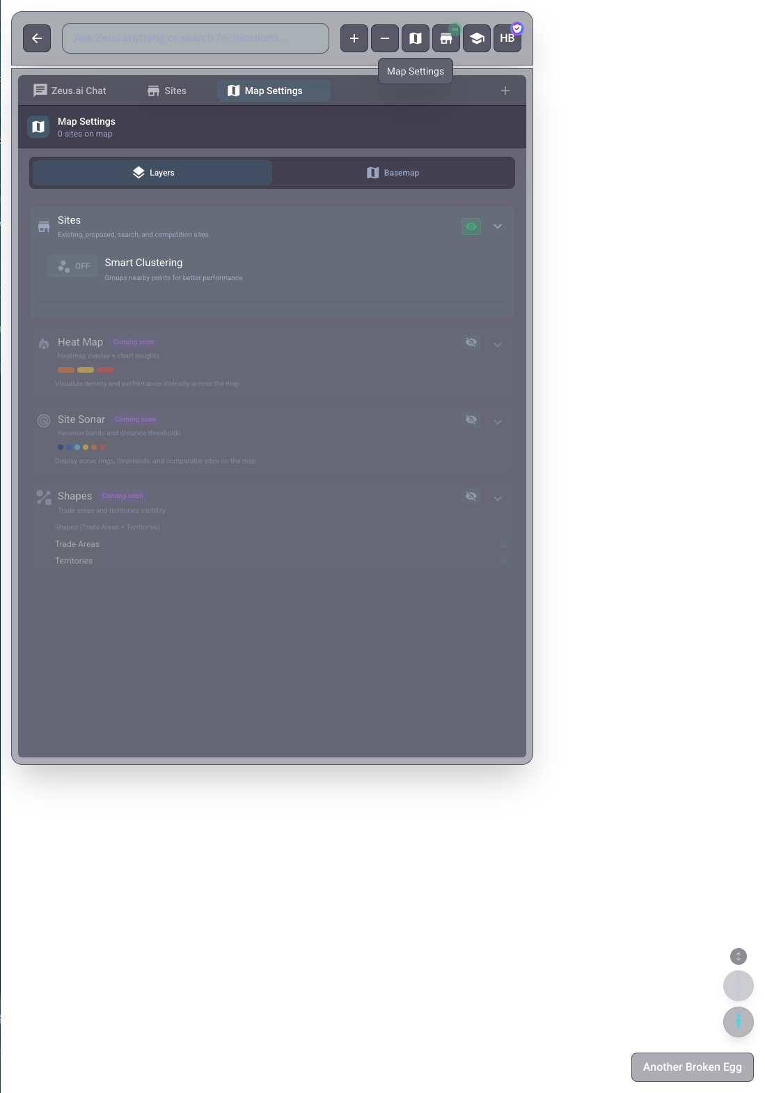
text
┌────────────────────────┐
│ [←]  Project Name  [👤] │  ◄── Top bar (back, name, profile)
├────────────────────────┤
│                        │
│         MAP            │
│     (full screen)      │
│                        │
│                 [🗺️]   │  ◄── Floating map controls button
├────────────────────────┤
│ [Input________________] │  ◄── Compact chat bar / toolbar
└────────────────────────┘
The Three-State Mobile Workspace
On phones, the workspace doesn't dock to a side — it lives at the bottom of the screen as an Apple-Maps-style sheet with three resting states. Drag the slim handle at the top of the sheet up or down to move between them, or rest the sheet at any height in between.
| State | What You See | Use It For |
|---|---|---|
| Collapsed | A compact chat composer pinned to the bottom (~75% width pill). Map is fully visible. | Map exploration with chat one tap away. |
| Peek | Sheet rises to show a tab strip + the first slice of tab content. Floating map controls tuck above the card. | Scanning Location Analytics, Sites, Site Sonar without losing the map. |
| Large | Sheet expands to cover most of the screen. Composer becomes a full-width pill at the bottom. | Reading long content (chat history, full Location Analytics). |
Behavior worth knowing:
- Drag-rest at any height — release the handle wherever you want and the sheet stays put.
- Smooth drag from large — dragging down from the large state animates back to peek or collapsed without jumping.
- Composer adapts per state — collapsed keeps the slim pill; peek and large show a centered full-pill composer that switches to the original
rounded-xleditor on focus. - Floating map controls appear in two columns alongside the peek card (compass and tilt on the left, pegman and map menu on the right) and hide automatically in the large state so they don't fight for space.
Where Things Move on Mobile
| Element | Desktop Location | Mobile Location |
|---|---|---|
| Back button (←) | Chat bar, left side | Top-left corner |
| Profile (👤) | Chat bar, right side | Top-right corner |
| Project name | Bottom-right badge | Top-center |
| Compass (3D-capable map) | On-map desktop controls | In floating mobile controls cluster |
| Chat bar | Bottom-left, partial width | Bottom, compact toolbar |
| Workspace panels | Side/docked panel | Three-state bottom sheet (collapsed / peek / large) |
| Map controls | In chat bar | Floating controls + popup menu |
| Views menu (analytics tabs) | Anchored dropdown | Bottom sheet (drag indicator + "Views" header) |
| Section header actions (analytics) | Inline buttons (settings, download, move up/down) | Collapsed into more (⋮) overflow menu; drag handle stays inline |
Touch Gestures
Map Navigation
| Action | Touch Gesture |
|---|---|
| Pan/move | Drag with one finger |
| Zoom in | Pinch outward with two fingers |
| Zoom out | Pinch inward with two fingers |
| Zoom to spot | Double-tap |
| Rotate | Rotate with two fingers (3D mode only) |
| Tilt | Drag up/down with two fingers (3D mode only) |
Chat Bar Interaction
| Action | How to Do It |
|---|---|
| Type a question | Tap the input field, keyboard appears |
| Send message | Tap the send button (➤) |
| Use voice | Tap the microphone icon (🎤) |
| Open sites | Tap the floating map button, then tap Sites |
| Open Layers | Tap the floating map button, then tap Layers |
| Open Base Map | Tap the floating map button, then tap Base Map |
| Zoom controls | Tap the floating map button to open + / − controls |
Panel Navigation
| Action | How to Do It |
|---|---|
| Open a panel | Tap a location marker or control button |
| Close a panel | Collapse or close the expanded panel |
| Switch tabs | Tap tab names at the top |
| Scroll content | Swipe up/down within the panel |
Mobile-Specific Features
Condensed Chat Bar
On mobile, the bottom toolbar is simplified:
- Chat input field: Main entry point for questions
- Map button (🗺️): Opens a mobile controls menu
- Voice / attach / send controls: Available in the compact composer
- Workspace tabs: Open in the expanded panel above the toolbar. Use the Tabs Menu button (
≡icon) in the tab strip to add, switch, or close tabs.
Workspace Sheet States
When the workspace sheet is open:
- Tabs appear at the top of the sheet, just below the drag handle
- Drag the handle up to enter the large state (covers most of the screen) for long reading
- Drag the handle down to peek (tabs + top of content visible) or collapse (chat composer only)
- Switch tabs without leaving the current map page
Compass on Mobile
When 3D-capable controls are available:
- Location: In the floating mobile controls cluster
- Function: Rotate / tilt controls for supported map states
- Behavior: Depends on current map/theme state
Analytics Section Header Controls
On desktop, hovering over an analytics section header reveals inline action buttons: Display Options (settings gear), Download as JPEG, and Move up / Move down arrows.
On mobile (screens narrower than 768 px), these secondary actions are collapsed into a single more (⋮) button at the right end of each section header to prevent them from overlapping the section title. Tapping ⋮ opens a small popover menu with the available actions. The drag handle and section close button remain inline.
Pinned sections (such as AI Summary and AI Metrics) that are in the collapsed state keep their inline expand and settings controls and do not show a ⋮ button.
Views Menu as Bottom Sheet
In analytics tabs (such as Location Analytics), a Views button near the top of the tab lets you switch between analytics views and run reports. On desktop it opens an anchored dropdown. On mobile (screens narrower than 768 px) it opens as a bottom sheet instead:
- Tap the Views button (grid-customize icon with the current view name) to open the sheet.
- The sheet slides up with a drag indicator and a "Views" header.
- Scroll the list to find Starter views and My views, then tap a row to apply it.
- To run the active view as a report, use the play-button control in the same sheet.
- Dismiss the sheet by dragging it down, tapping outside it, or tapping the close control.
Keyboard Behavior
When typing in the chat:
- Keyboard appears from the bottom
- View adjusts so you can see what you're typing
- Tap outside the input or tap "Done" to hide keyboard
Panel Tabs on Mobile
When you open the secondary workspace, tabs appear at the top. A Tabs Menu button (≡ icon with an open-tab count badge) sits at the right end of the tab strip and opens a bottom sheet for adding new tabs, switching between open ones, or closing them — the same Tabs Menu available on desktop.
| Tab | Icon | Purpose |
|---|---|---|
| Sites | 🏪 | Location list and filters |
| Location | 📊 | Location Analytics details |
| Chat | 💬 | Expanded AI conversation |
| Layers | 📚 | Clustering, filters, data layers |
| Base Map | 🗺️ | Themes, labels, base cartography |
Tab labels in the strip are shortened for space: Location (full name: Location Analytics), Chat (full name: Chat). All other tab names are unchanged from desktop.
Layers and Base Map on Mobile
What used to be the single "Map Settings" tab is now two separate workspace tabs, opened by two buttons in the mobile floating map controls:
- Layers: Smart Clustering, site layer filters, performance stats
- Base Map: Themes, data layers, POI categories, and appearance settings
Tips for Mobile Users
Better Touch Targets
- Buttons are larger on mobile for easier tapping
- Tap confidently - the interface is designed for touch
- If something doesn't respond, try tapping more precisely in the center
Managing Screen Space
- Close panels when you need to see the map
- Rotate your device to landscape for more horizontal space
- Zoom out on the map to see more locations at once
Battery and Data
- Large datasets may use more data on mobile
- Close the app when not using to save battery
- Use WiFi for the best experience with map loading
Common Mobile Actions
Finding a Location
- Tap the input field in the chat bar
- Type your search (e.g., location name or address)
- Tap Send (➤)
- AI responds with matching locations
- Tap a result to see it on the map
Viewing Location Details
- Find a marker on the map
- Tap the marker (pin)
- Location Analytics opens in the expanded mobile workspace
- Swipe up to see more details (Zeustimate, Demographics, etc.)
- Tap X to close and return to map
Filtering Locations
- Tap the store icon (🏪) in the chat bar
- Sites opens in the expanded mobile workspace
- Toggle "Filtering Map" to connect filters to the map
- Adjust filters using the controls
- Tap X to close and see filtered map
Changing Layers or the Base Map
- Tap the floating map icon (🗺️)
- In the mobile controls menu, tap Layers (📚) for clustering, site filters, and data-layer toggles, or Base Map (🗺️) for map theme, labels, and base cartography
- The tab you tapped opens in the expanded mobile workspace
- Adjust settings (clustering, themes, layers)
Using Voice Input
- Tap the microphone (🎤) in the chat bar
- Allow microphone access (first time only)
- Speak your question clearly
- Tap again when done (or it auto-stops)
- Your words appear as text
- Tap Send to submit
Troubleshooting Mobile Issues
Map Not Responding to Touch
- Try reloading the page (pull down to refresh)
- Make sure you're touching the map area, not a panel
- Check if a popup or dialog is covering the map
Keyboard Covering Content
- Scroll up while keyboard is open
- Try rotating to landscape mode
- Tap outside the input to dismiss keyboard first
Panels Not Opening
- Make sure you're tapping precisely on the button
- Check your internet connection
- Try refreshing the page
3D Mode Issues on Mobile
- Two-finger gestures required for tilt and rotate
- Tap compass to reset view if stuck
- Performance may be slower on older devices
Slow Performance
- Enable Smart Clustering in the Layers tab
- Close other apps to free memory
- Zoom in to reduce the number of visible markers
- Use WiFi instead of cellular data
- Close and reopen the browser
Offline Limitations
Zeus.ai requires an internet connection. If you lose connectivity:
- Map tiles may not load
- AI chat won't respond
- Analytics won't update
- Reconnect and refresh when back online